

Why is `position: absolute` not working as expected?
Why is `position: absolute` not working as expected?

While using the CSS position property, it's critical to understand how it works, but most importantly - why it might not work as expected!
Before we move further, I have a suggestion. Ask yourself every time you're tempted to use absolute positioning, "Do I really need it in this case?" I recommend reading this article of Shadeed Ahmad if you’re not sure.
Below are the 4 things you may be doing wrong:
1. You don't have a correctly positioned parent
It's difficult to grasp this concept at first. Let me give you an example:
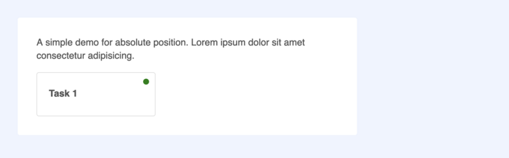
See that green dot there? That needs absolute positioning. But you cannot simply use position: absolute on that element with top and right values to place it there.
Here's the markup:

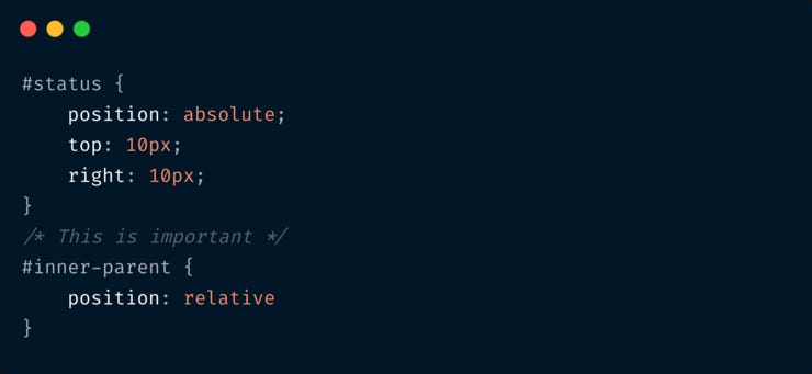
If you do just add styles to #status element like this:

You end up with this:
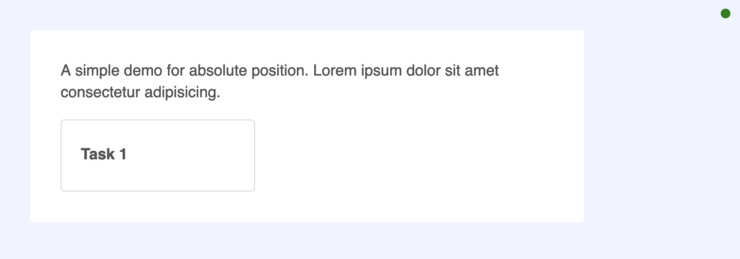
Notice where the green dot has gone? It's at the top right corner of the page. That's because its placement is relative to the body element, and not the #inner-parent.
When you use absolute: position on an element (the #status element in our case), the browser first removes it from the normal flow. Then it looks at the position property of its parent element (in our case #inner-parent). If this parent has its own position set to anything other than static - like relative or absolute, then our #status element gets positioned with respect to the #inner-parent.
But because we haven't set the position of #inner-parent, the browser then looks at the next parent - which is the #outer-parent. And no, even this element has no position set. So finally it places the #status element with respect to body itself (at the top right corner) based on the top and right values.
So how do we get the desired output? Set the position of #inner-parent like this:
Great! This gives us what we want. Refer to the demo on CodePen.
Now can you guess what happens if we use position: relative on #outer-parent instead of #inner-parent?
Yes, this is what happens 👇

Now our green dot is placed with respect to the nearest parent element whose position value is not static. This is exactly how absolute position works.
2. The z-index property is not set
Here's the second and another common reason. You set position: absolute to your element and set the parent's position to relative too, but your element becomes invisible! Sometimes you may be working with a huge web page developed by someone else. And there might be another element hiding yours.
So use the browser inspector and check if there's an element with higher z-index that is making yours invisible. And accordingly you can set a z-index value.
3. No width specified
Block-level elements like div, section, header, footer - all have a width of 100% by default.
But the moment you add position: absolute to any of them, they don't behave like block-level elements anymore. So you will have to specify the width explicitly, say width: 100%. Otherwise your element is invisible!
4. You have a parent element with transform property
Let's go back to our initial example and assume that this is the desired output 👇

We already saw that applying position: relative to the #outer-parent instead of #inner-parent gives us this output.
There's ONE exception though. If you happen to use the transform property on #inner-parent like this:
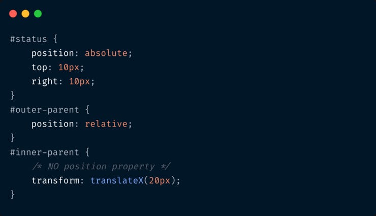
Now the green dot is placed with respect to #inner-parent itself! Whaaat? Check the demo for yourself.
This is because, transform property creates a new stacking context.
It's a rare case that you position an element with respect to an outer parent and use transform on an inner parent. But hey, it might happen. And if you don't know that a transform property and a few others can change the stacking context, you'll keep debugging for hours! I myself learnt this yesterday 🤷♀️
Have you encountered any scenario where position: absolute did not work as expected for a reason I've not specified above? Do share it with me! It's hard to explain these concepts in written format, but I really hope you understood.
📘 Complete Guide to CSS Flex and Grid
If you loved this write-up and how it was explained, you’ll absolutely love my eBook CSS Flex and Grid. Check it out!
📨 Newsletter suggestion
I love Tailwind CSS. If you love it too, I highly recommend subscribing to this one 👇
Tailwind Weekly: Weekly newsletter about all things Tailwind CSS. New issue every Saturday.