


Where is "inline-flex" used?

You may or may not know what display: inline-flex does. But do you actually know why and where to use it?
An example
I'm sure you've seen tags like these to "follow interests" when you sign up on a social media site.

And let's say here's the markup for this:

Using flexbox, you would probably create two flex containers, one for div and another for the section element. Like this:
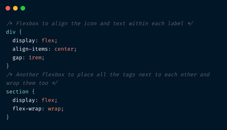
Nothing wrong with this approach, but it's extra code. This is where inline-flex comes into picture.
Better approach
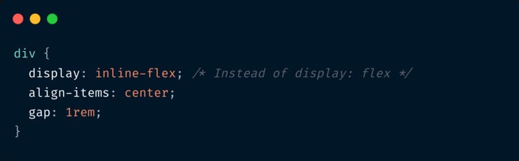
Remove display: flex and flex-wrap: wrap on the section element (The last 4 lines in the above code snippet). This is what we have now:

We have each div stretching full width because it's a block level element and also because display: flex makes it behave like a block level element. But we need the "inline" behavior - that is - not occupy full width and not start a new line. Which is what display: inline does.
But can we add both display: flex and display: inline on the same element? No, but we can combine them to make it display: inline-flex 😊
Now we're left with this, and it works!
Summary
1. We use display: inline-flex when we want the element to be a flex container but also behave like an inline element instead of block-level. (Just like how we use display: inline-block)
2. Using display: inline-flex does not affect the behaviour of the flex items within it. It is the only property in flexbox that affects the behaviour of the container itself and not the items. (I guess!)
Did you learn something new?
📘 Complete Guide to CSS Flex and Grid
If you loved this write-up and how it was explained, you’ll absolutely love my eBook CSS Flex and Grid. Check it out!
📨 Newsletter suggestion
I love Tailwind CSS. If you love it too, I highly recommend subscribing to this one 👇
Tailwind Weekly: Weekly newsletter about all things Tailwind CSS. New issue every Saturday.