


Did you know about scroll padding? Easy solution to fixed header problem
Did you know about scroll padding? Easy solution to fixed header problem

If you've ever had a fixed header with navigation bar and links to sections on the same page, you surely have faced this problem. You click on a link and the page smoothly scrolls to the particular section, but the top part of the section gets hidden behind the fixed header.

To explain this problem in a few words - let's say you have a section Products with id products.
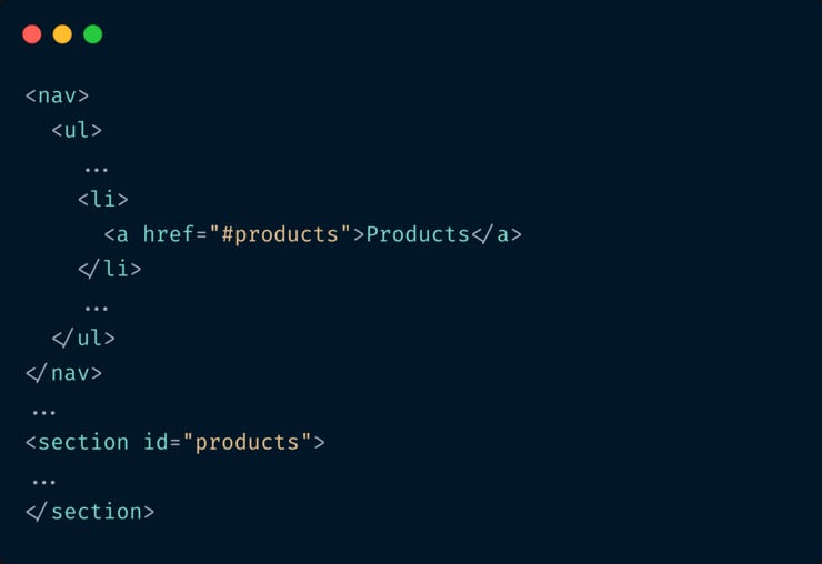
Clicking on the #products link makes the page scroll down to the products section with the top of the section aligned with the top of the browser. This is perfect unless you have a fixed header.
Take a look at the problem for yourself.
Earlier we had to solve this with JavaScript detecting the link click and manually adding an offset at the top.
Thankfully we have a super easy solution to this with CSS scroll-padding property.

With this solution, even if the fixed header height varies on different device sizes, we can change the scroll-padding-top value too for various devices using media queries
With this solution, even if the fixed header height varies on different device sizes, we can change the scroll-padding-top value too for various devices using media queries.
Hope you learnt something new today :) Let me know by hitting a “reply” to this mail.
📘 Complete Guide to CSS Flex and Grid
If you loved this write-up and how it was explained, you’ll absolutely love my eBook CSS Flex and Grid. Check it out!
📨 Newsletter suggestion
I love Tailwind CSS. If you love it too, I highly recommend subscribing to this one 👇
Tailwind Weekly: Weekly newsletter about all things Tailwind CSS. New issue every Saturday.
With this solution, even if the fixed header height varies on different device sizes,
With this solution, even if the fixed header height varies on different device sizes, we can change the scroll-padding-top value using media queries
With this solution, even if the fixed header height varies on different device sizes, we can change the scroll-padding-top value too for various devices using media queries