

Collapsible Q&As with pure HTML and CSS

You can create this collapsible FAQs style component using only HTML and CSS and style it however you like.

I don’t know for how long this has been possible with just HTML an CSS, but I discovered this only recently and I thought many of you might not be aware too.
This issue is sponsored by Tailscan

Tailscan is a browser devtool for Tailwind CSS. It helps you build, design, and debug your Tailwind website visually in the browser. Tailscan offers autocompletion, config support, class validation, and visual guidelines. It also allows you to scan other Tailwind websites. With Tailscan, you'll instantly improve your development experience.
Let’s see how it’s done
Details and Summary Tags
Yes, HTML has these <details> and <summary> tags natively for these kinds of components. You don’t even need any CSS or JS to do this:
The HTML code:
<details>
  <summary>
    Is there a trial period for your product?
  </summary>
  Yes, we offer a 14-day free trial period so you can experience the product's benefits first-hand.
</details>
<!-- And more -->
Add both - the question and answer within a <details> element. And then wrap the question alone within <summary> tags.
And now you can style the summary element and the rest of the details however you wish.
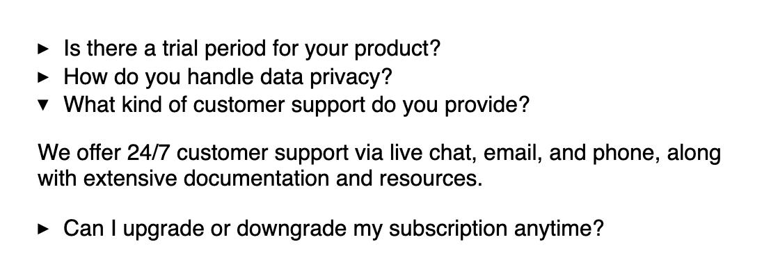
Styling the open state
In the left-side screenshot above, notice that the details element has a background color only when it’s opened.

This can be done using the [open] selector:
details[open] {
  background-color: #f1f5ff;
}You can even make the summary text bigger when it’s opened:
details[open] > summary {
  font-size: 1.2rem;
}
Changing the default marker
The default “caret” marker on the left might not fit into your theme. You can remove it completely. And use a different icon elsewhere, or not.

To hide the default marker, you can use the list-style property
summary {
  list-style: none;
}
But this isn’t supported in all browsers, so for Webkit-based browsers, such as Safari, to remove the marker, additionally use:
summary::-webkit-details-marker {
  display: none
}
Next, you can add any icon you wish in the summary element like so:
<summary>
  <p>
    Is there a trial period for your product?
  </p>
  <span>
    <i class="fa fa-chevron-down"></i>
  </span>
</summary>
Use flexbox to display them next to each other:
summary {
  display: flex;
  justify-content: space-between;
}
Lastly to turn the chevron “up”, use the [open] selector and rotate the element:
details[open] > summary > span {
  transform: rotate(180deg);
}Isn’t this amazing? Let me know if you learnt something new today :)
📘 I’m writing a new book!
If you loved this write-up and how it was explained, you’ll absolutely love my next eBook Level up with Tailwind CSS. Pre-orders are open. Order it now before the prices go up!

📨 Newsletter suggestion
I love Tailwind CSS. If you love it too, I highly recommend subscribing to this one 👇
Tailwind Weekly: Weekly newsletter about all things Tailwind CSS. New issue every Saturday.
Awesome